Conventional wisdom goes that prior to market tops, the major averages become more reliant on just a handful of stocks to lead the rally. When stocks are making new highs, it’s important to look at breadth indicators because indices can pull a nasty trick of masking what is actually happening to the majority of stocks. For instance, the S&P 500 is up 2.3% YTD, however, the average S&P 500 stock is down 0.7%.
One of the most popular ways of measuring market participation is with the NYSE Advance-Decline line. This indicator measures how broad or narrow participation is. When stocks are breaking out to new highs, you want to see the Advance-Decline line confirming this by also making new highs. If stocks made new highs with the A/D line falling, this might give people reason to question the sustainability of the rally. If this bearish divergence were to persist, it’s reasonable to think it’s only a matter of time before the weakness infects the rest of the market.
One of the problems is that these divergences can often be false positives. In bull markets these generally resolve themselves to the upside, making it impossible to know in real time which one will matter. So rather than looking at all of the times these divergences failed to come to fruition, I wanted to take a look a what sort of warning, if any, was provided by the advance-decline line prior to previous major market tops.
In the table below, you’ll see the number of days it took for the S&P 500 to peak after the advance-decline line peaked, and the returns in-between. The average number of days between the peak of the advance-decline line and the peak in stocks was 287 days (the market trades ~250 days a year), and the average change is 12%.
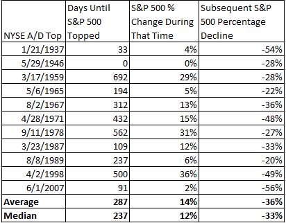
Clearly, one of the issues with relying solely on breadth is that it while it gives you a good X-ray of the market, it tells you nothing about how long stocks can advance as participation narrows. As an example, the advance-decline line peaked in April, 1998 and the S&P 500 didn’t stop going higher for another 500 days, during which time it advanced 36%. Looking at the tech bubble, we see that although the divergence was so obvious and stocks did eventually get cut in half, it took so long for it to finally matter. Whether or not this indicator worked is in the eye of the investor.

Although the timing wasn’t very helpful, before you dismiss technical analysis, it’s important to keep a few things in mind. The advance-decline line is is just one of many tools that professional technicians use to measure market participation. Dismissing the validity of this practice would be like valuing a stock using just price/sales, then throwing out fundamental analysis if the sock didn’t perform the way you had expected. There are several guys that have recently done excellent work taking breadth analysis several steps further, most notably Andy Thrasher, Dana Lyons, Ryan Detrick and Charlie Bilello.
Back to today. The thing that’s getting lost in all the talk about breadth is that what we’re currently experiencing is not a bearish divergence. It’s not as if stocks are screaming higher while the advance-decline line is making a series of lower highs. The Russell 3000, which represents 98% of the investable U.S. stock market, is up just 2.3% YTD.

So has this indicator been reliable, terrible, or something in between? It probably will depend on who you ask. Skeptics would say that on average, you had to wait more than a year after the divergence first appeared before the market peaked. Believers would say that although stocks climbed 14% on average, stocks eventually did fall much further.
The reason I went through this exercise is not to debunk the importance of market breadth or to say that the lack of participation in today’s market should be swept under the rug. What I’m always trying to do is dig a little deeper and challenge people who draw lazy conclusions using single data points.