“Even if there weren’t fees and expenses, the odds are you’ll underperform.” -Hendrik Bessembinder
An excellent piece from Bloomberg came out over the weekend, The Math Behind Futility, which looks beyond the usual explanations as to why the majority of professional stock pickers fail to keep up with an index. No, it’s not just the fees or the competition, but rather, the simple reason why so many managers fail to beat the benchmark is because so many stocks fail to beat the benchmark. Compounding manager’s problems, the biggest winners have an outsized impact on the index, and there is a steep price to pay for missing them.
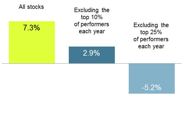
This image below from Dimensional Fund Advisors shows how devastating it can be to not own the best stocks each year. From 1994-2016, missing just the top 10% of performers each year, which obviously is just as impossible as missing the bottom 10% of performers, but just to illustrate the point, missing the top 10% takes the annualized performance from 7.3% down to 2.9%.
The Bloomberg article links to a paper, Why Indexing Works, which provides evidence of how the skew affects portfolio returns. Think about a world where only five stocks exist. Four of these stocks gain 10% while one gains 50%. This is an oversimplified example, but for the sake of illustration, here is what that the results look like if you were to randomly select a one or two stock portfolio and equal weight them.
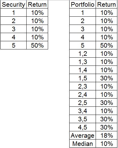
The average (index) return is 18%, but the median (fund manager) return was just 10%. So ten of the fifteen will underperform because of how concentrated the returns are. To inject some real world examples, in 2015, Facebook, Amazon, Netflix and Google, colloquially known as FANG, were responsible for all of the returns of the S&P 500. If you didn’t own or were just underweight any of those four stocks, your results probably weren’t so great. In 2016, the average S&P 500 stock returned 1.5 percentage points above the median, according to the article. And so far in 2017, the average S&P 500 stock is up 4.56%, while the median is up 4.35%
These numbers, daunting as they are, are looking at just one side of the ledger, the raw data. They’re not discussing the difficulty of holding onto winning stocks. The chart below shows the drawdowns- or how far it fell from its peak- for of one of the best stocks over the last fifteen years.
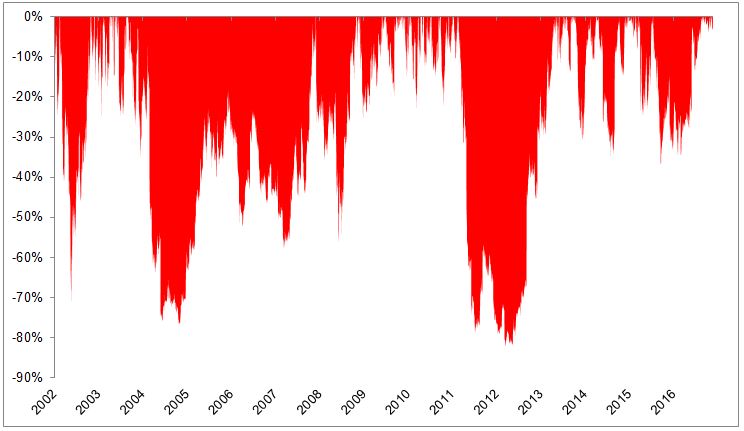
Those vomit-inducing drawdowns belong to Netflix, which has gained 12,300% since its IPO, or 38% a year!
Indexing isn’t perfect, and it certainly isn’t easy, but it’s a pretty good place to start. Unfortunately, one thing that gets lost in all of the back and forth between active and passive is that it doesn’t have to be all or nothing, there is room for both in the world and in your portfolio. The most important thing is deciding what mix is right for you and sticking with it!