I tweeted this chart earlier.

This chart shows that the five largest S&P 500 stocks have a market capitalization equal to the bottom 282 S&P 500 stocks. This turned out to be something of a Rorschach test, which was not my intention. I just thought it was a powerful visual. I wasn’t really trying to make a point, certainly not the point that many thought I was going for.
The reason I made that chart was because I was working on this post today, which will attempt to show that there are plenty of other stocks outside of FAANG that are doing just fine. That tweet had the opposite effect. Hopefully this will remedy that.
The chart below shows the average returns of S&P 500 stocks year-to-date broken down by market cap decile. The first decile is the 50 largest stocks, the second decile is the next 50 largest stocks, and so on. You can plainly see that while the mega caps are performing well, and powering the index higher, there are other stocks that are doing just fine. The 4th, 6th, and 7th deciles are performing better than the 2nd and 3rd.

It is pretty wild to think that the five largest stocks are as large as the bottom 282 S&P 500 stocks, but the truth is, this is how a cap weighted index works. Yum! Brands can triple and it still would not move the needle of the index as much as if Apple gains 1%.
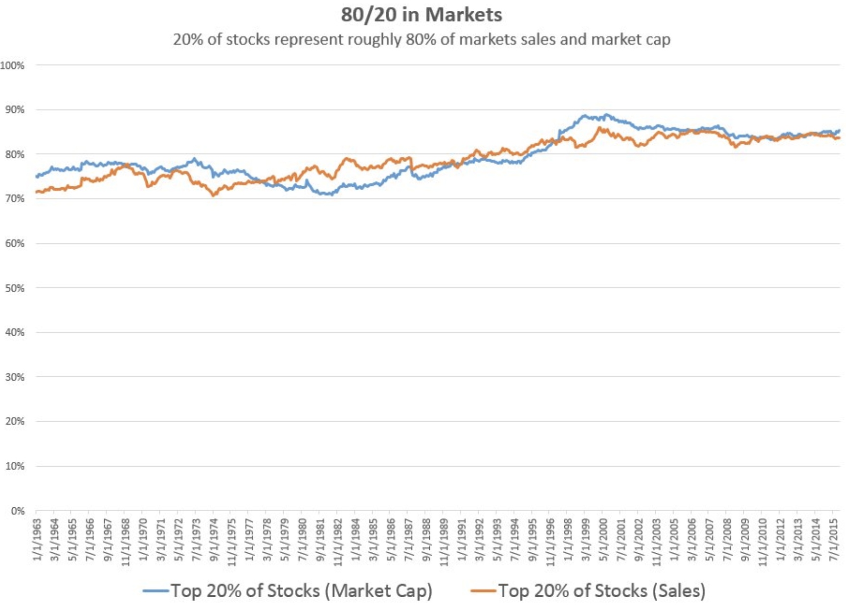
We are not in uncharted territory. The Pareto Principle is a feature of financial markets, not a bug. This chart from Patrick O’Shaughnessy shows how remarkably steady this has been over history.
This chart below from S&P (h/t Lawrence Hamtil) shows that the top five stocks are not nearly as large a portion of the index as they used to be. What makes today unique is the top five are tech stocks (I know Amazon is technically consumer discretionary). It obviously wasn’t always like this. In 2010, for example, the top five were Exxon, Microsoft, Apple, Proctor & Gamble, and Johnson & Johnson. 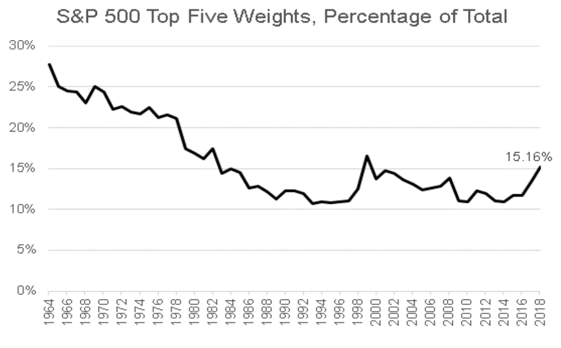 If gains were really concentrated in the hands of just a few stocks, you would expect to see a wide spread between the S&P 500 and its equal-weight counterpart. Year-to-date the cap-weighted index is up 6.15%, while the equal-weight index is up 4.32%. Okay, actually, this is a fairly wide spread, but it’s probably a lot smaller than most people think.
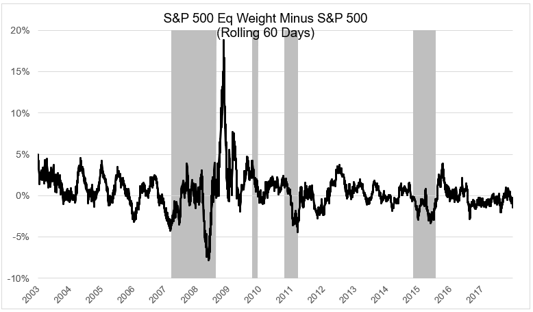
The chart below shows the 60-day difference between SPY and RSP (the shaded gray regions are drawdowns greater than 15%). The cap weighted index’s outperformance over the past 60-days hardly registers. One can argue that 60 days is arbitrary. Fair enough.
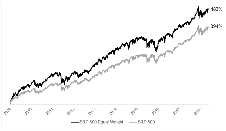
Since January 2015 (when FANG came into the lexicon) the S&P 500 is up 46.5% while the equal-weight version is up 37.8%. Again, not an insignificant spread, but the average stock has done relatively fine. Going back a little farther to the bottom in 2009, the equal weight version has handily outperformed the cap-weighted version. For the past nine plus years, the many actually outperformed the few.
The bottom line is this: While it’s convenient to slap a this will not end well label on this market, or shout that passive flows are distorting price discovery, the reality is that there is nothing abnormal about the top five stocks being where they are today. So why did the tweet go viral? A picture says a thousand words, and maybe this chart really opened up people’s eyes to the way cap-weighted indices work.
Anyway, buy the tweet, sell the blog post.
***
For the record, if you took the time to read what the tweet said, the chart was pretty clear in what it was showing. If you were misled, that was not my intention. Misleading is not my M.O. The top 5 companies have a market cap of $4.09T, the next 213 companies have a market cap of $17.14T, and the remaining 282 have a market cap of $4.02T