In the new edition of J.P. Morgan’s Guide to the Markets (H/T @ROIChristie), they show this incredible chart about what the average S&P 500 returns were 3, 6, 12, and 24 months following a stock market peak (and subsequent bear market).
Charts like this convey an important message; They show that if you believe in a better tomorrow, and you’re able to control your emotions, then it’s likely that you possess the ability to participate in the long-term growth of the economy. While I totally agree with the message of long-term discipline, sometimes facts don’t tell the entire story.
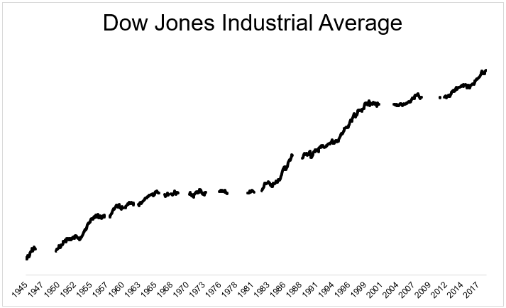
I know this isn’t what they’re saying, but it’s sort of like the chart below, which shows how easy investing would be easy if it weren’t for all the bear markets (h/t @EddyElfenbein).
We know, however, from studies and personal experience, that losses are felt twice as strongly as an equivalent gain. So we can have all the stats and all the data, and still not be able to hang on when the wheels fall off.
In conclusion, I like that chart, and haven’t written a blog post in a while.
Michael Batnick is a managing partner at Ritholtz Wealth Management. He is the co-host of Animal Spirits, What Are Your Thoughts, and The Compound and Friends. For disclosure information please see here.
Get a Full Investor Curriculum: Join The Book List
Every month you'll receive 3-4 book suggestions--chosen by hand from more than 1,000 books. You'll also receive an extensive curriculum (books, articles, papers, videos) in PDF form right away.