Unless the selling stops tomorrow, the S&P 500 is about to experience something it has only done once since 1960- two separate 10% drawdowns in one calendar year.
This last happened in 1990, when stocks fell 10% right out of the gate, made a new intra-year high, and then fell another 19.9%.
Stocks experienced a 10% correction to start the year, made new highs, and with one more day of selling, will reach this undesirable mark. Is this particularly meaningful? Not really, but maybe it helps to explain why the selling accelerated so quickly. Perhaps people were lulled into a false sense of complacency earlier in the month, which of course is only something you can say with hindsight.
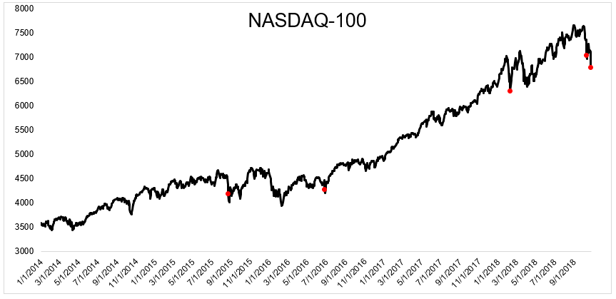
Today sucked, and it sucked the hardest for tech stocks. The NASDAQ 100 fell 4.6%, which is just the fifth 4% drop since 2014.
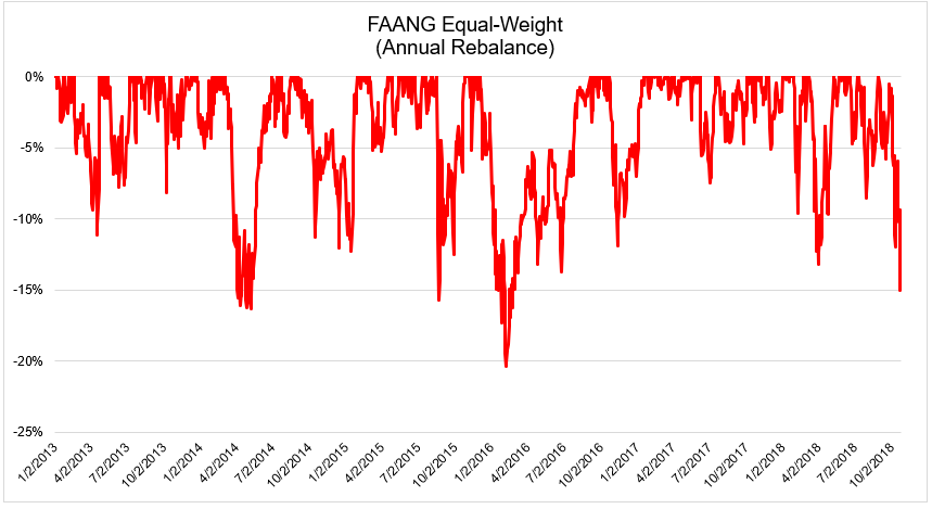
The stocks that led on the upside are now leading to the downside. The chart below shows the growth of the FAANG stocks going back to 2013. While this probably doesn’t make the recent selling feel any better, these stocks are still up 22% in 2018, on average.
The group collectively is in a 15% drawdown, which we’ve seen multiple times throughout this run. What’s different today is that we’re many years into this bull market, and interest rates were at a much lower rate during each of the previous corrections.
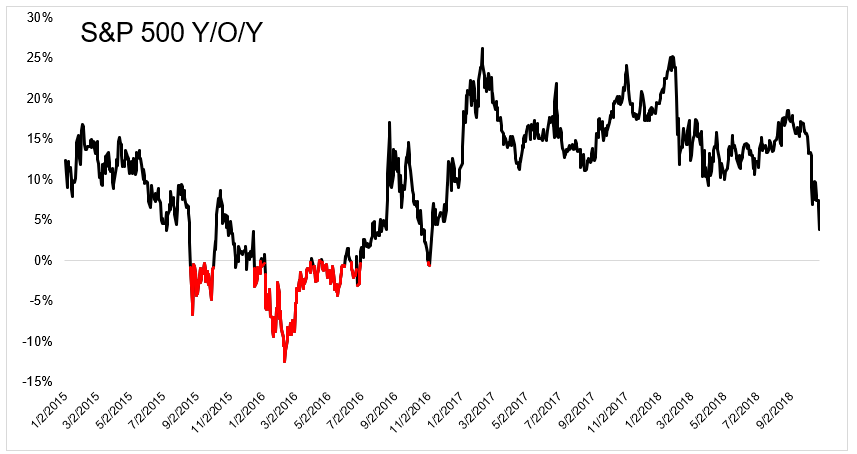
The S&P 500 hasn’t been negative y/o/y since November 2016. This could change quickly if the selling continues.
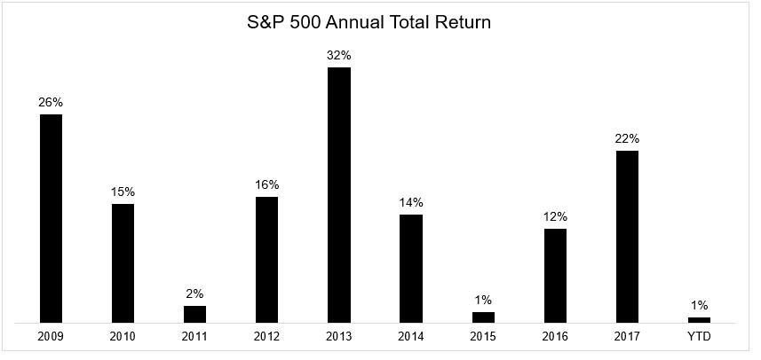
The returns over the last few years in the United States have been abnormally large. We know that pullbacks, corrections, and bear markets are part of the deal. Hopefully you prepared for this, strategically, financially, and emotionally.
Michael Batnick is a managing partner at Ritholtz Wealth Management. He is the co-host of Animal Spirits, What Are Your Thoughts, and The Compound and Friends. For disclosure information please see here.
Get a Full Investor Curriculum: Join The Book List
Every month you'll receive 3-4 book suggestions--chosen by hand from more than 1,000 books. You'll also receive an extensive curriculum (books, articles, papers, videos) in PDF form right away.