When people look at financial markets, they see numbers and they hear narratives. But data can hide the past and stories can distort the present.
The Dow gained 8% from 1966-1982. What does this reveal about what it was like to live and invest over this 17-year period? Nothing.
History books will describe the last ten years as “a period of moderate economic growth on the back of accommodative central bank policy.” This tells you very little of what actually happened.
Numbers can help convey what’s going on around you, so with this in mind, let’s look back at the last ten years for U.S. stocks.
It’s hard to believe, but based on a number of different metrics, this has been the best ten-year period for our stock market.
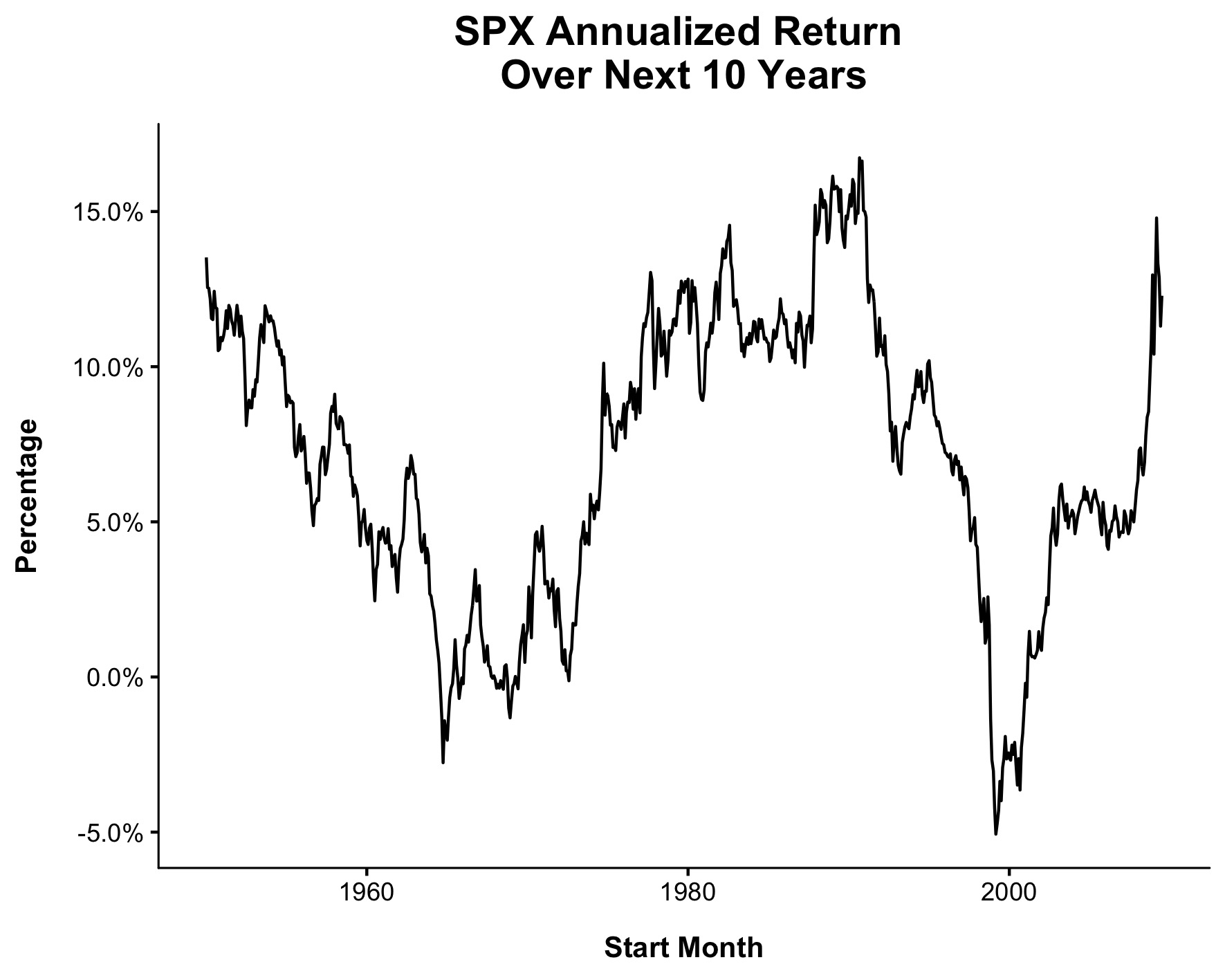
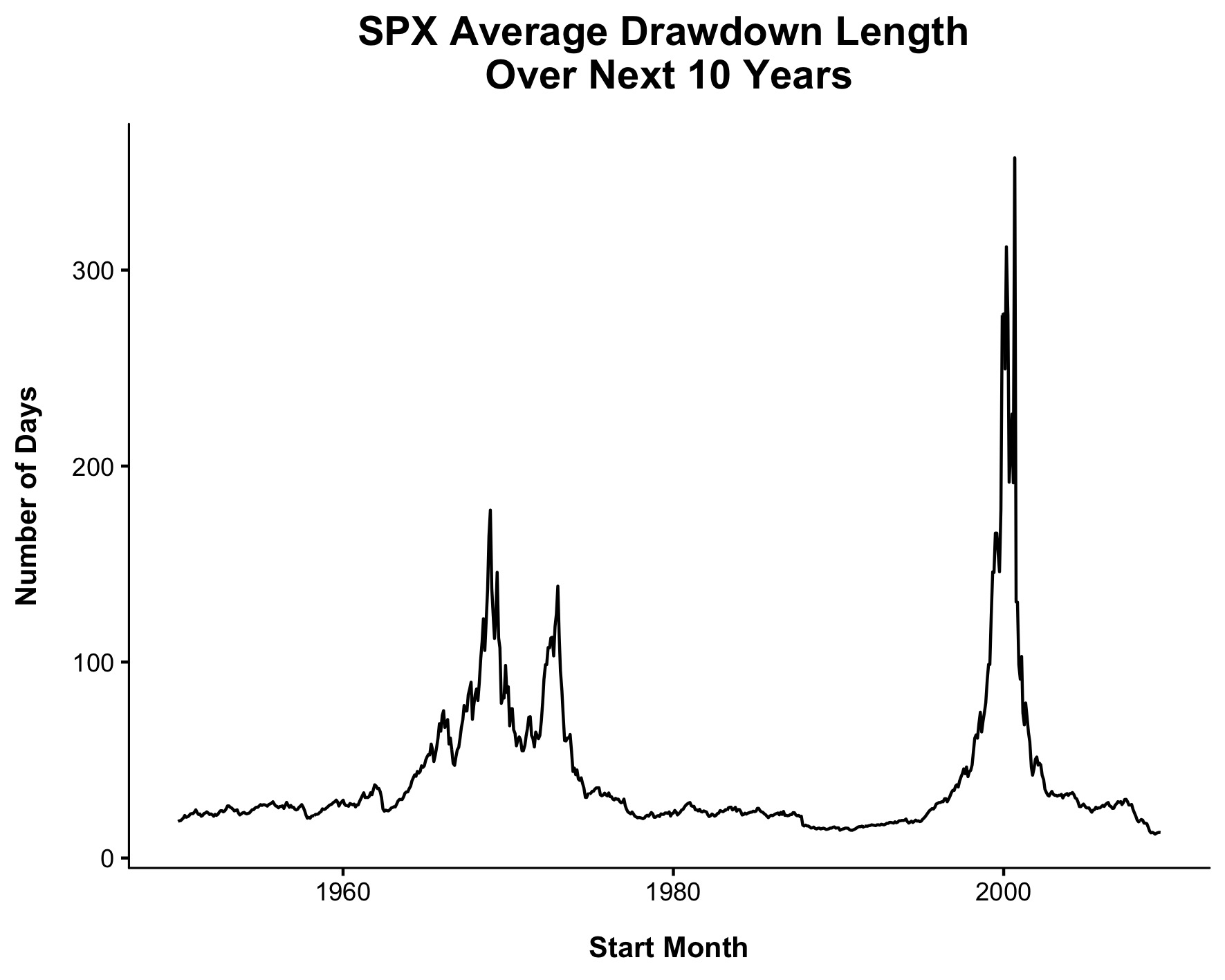
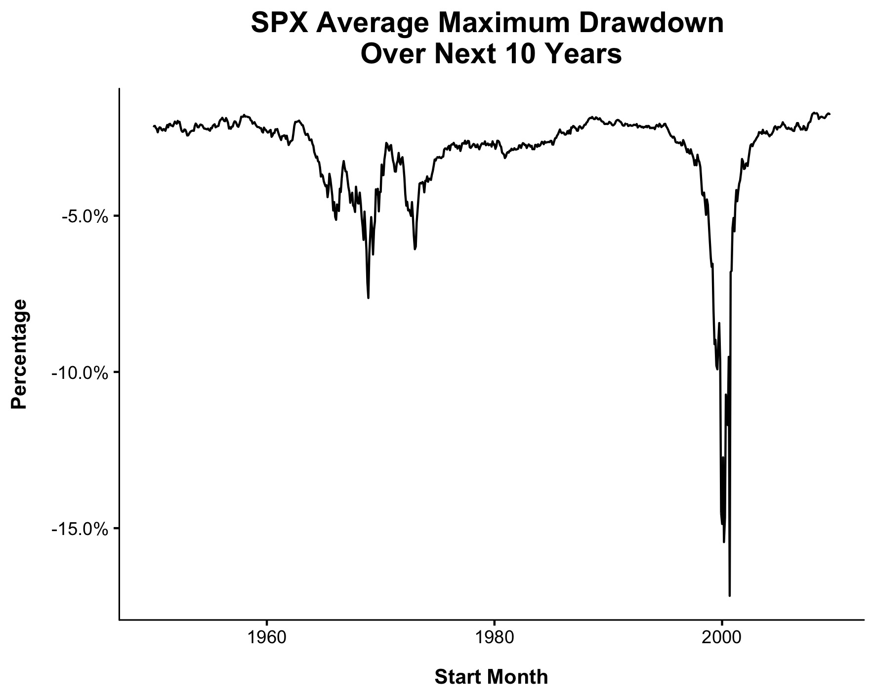
Rather than tell a story about why this happened, I’m going to let the data do the talking. Nick Maggiulli, helped me put together some killer charts that demonstrate how incredible this recent period has been. (Everything is price only, beginning in 1950. Data from Ycharts)
We’ll begin with returns. At ~12% a year, this not quite the best ten-year period ever, but its in the 90th percentile.
There have been 342 new highs over the last ten years, the most of any ten-year period ever (well, technically March 2009 – Feb 2019 had 359).
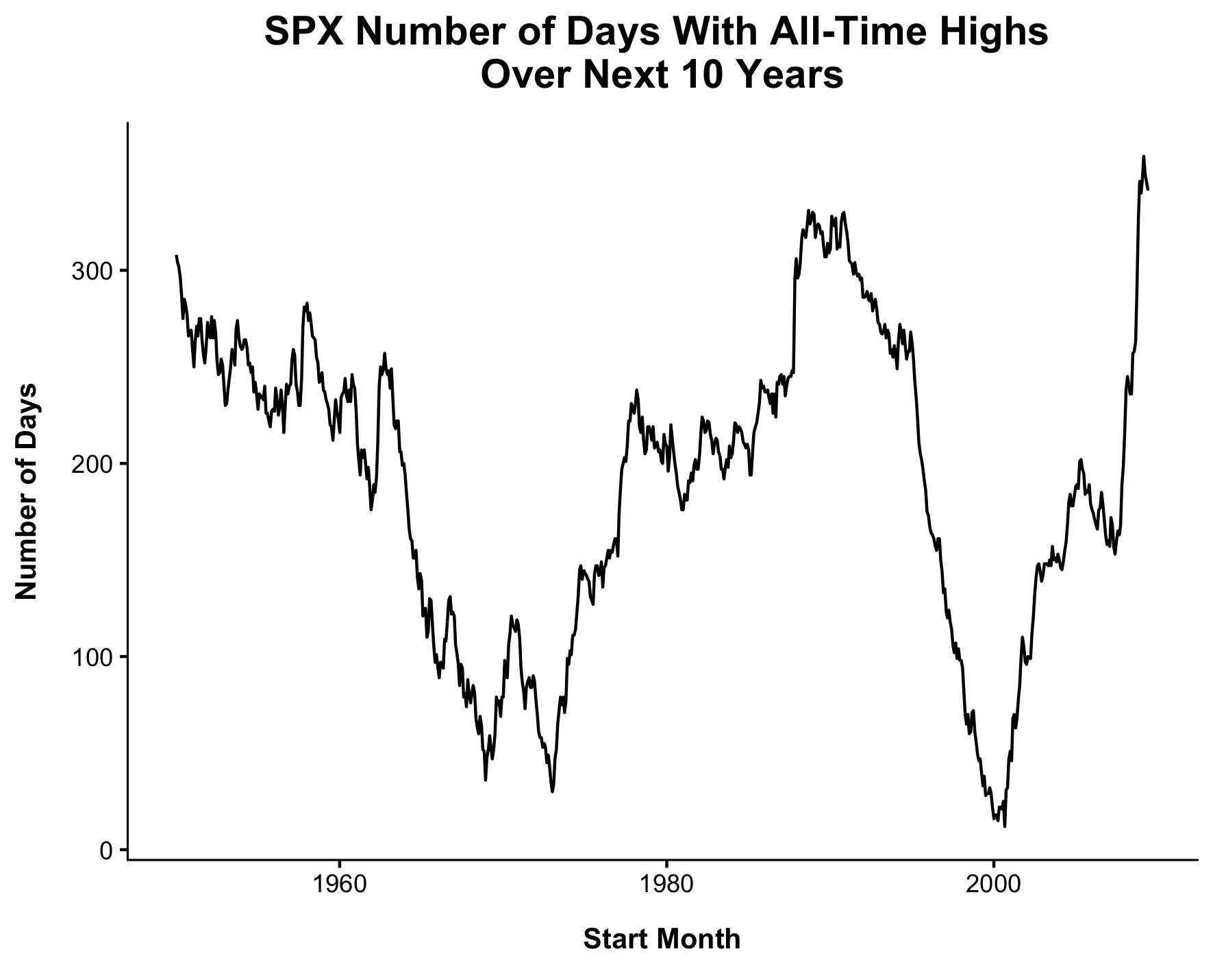
The average time between new all-time highs was an incredible 13 days. (It got as low as 12.2 days in the ten years ending Feb 2019). For context, the next best ten year period by this metric was 1990-2000, which got as low as 14.2 days).
The next one might be a little confusing so let me explain exactly what it means. Let’s say there were 100 drawdowns over the last ten years. I took the lowest point for each, then took the average across all 100. The average maximum drawdown over the last ten years was just 1.7%, the lowest reading going back to 1950. The next best reading by this metric was 1958-1968, which was 1.8%.
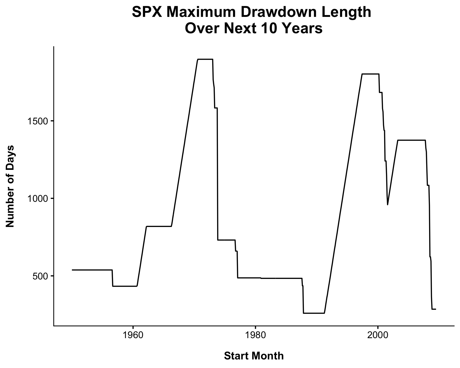
The longest the market went in between new all time highs was 285 days. The best ten years by this metric was 1988-1998, which had a max of 259 days.
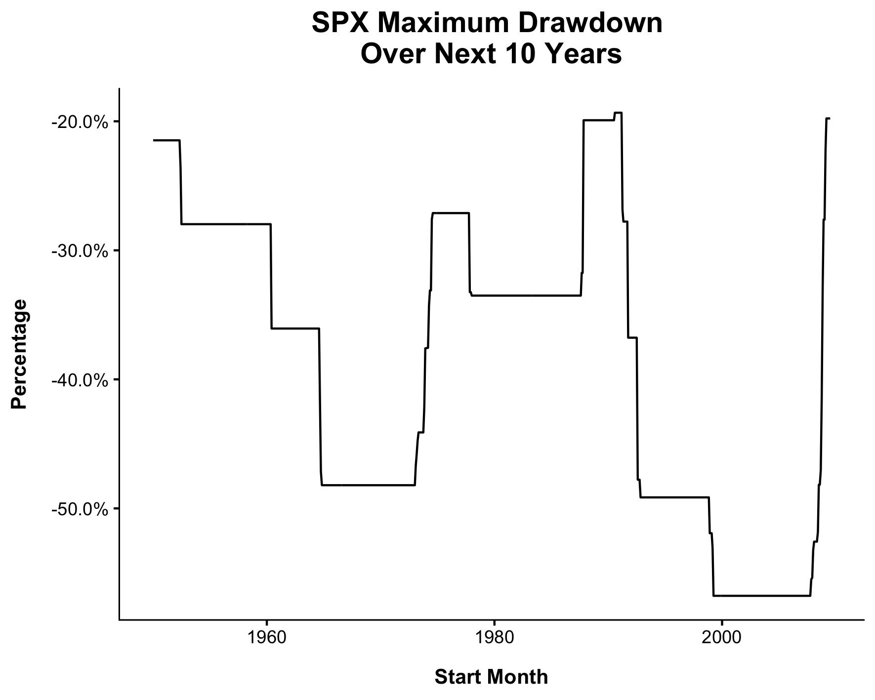
The worst drawdown on a closing basis over the last ten years was 19.8%. The best period using this metric was 1991-2001,which experienced a max drawdown of 19.3%
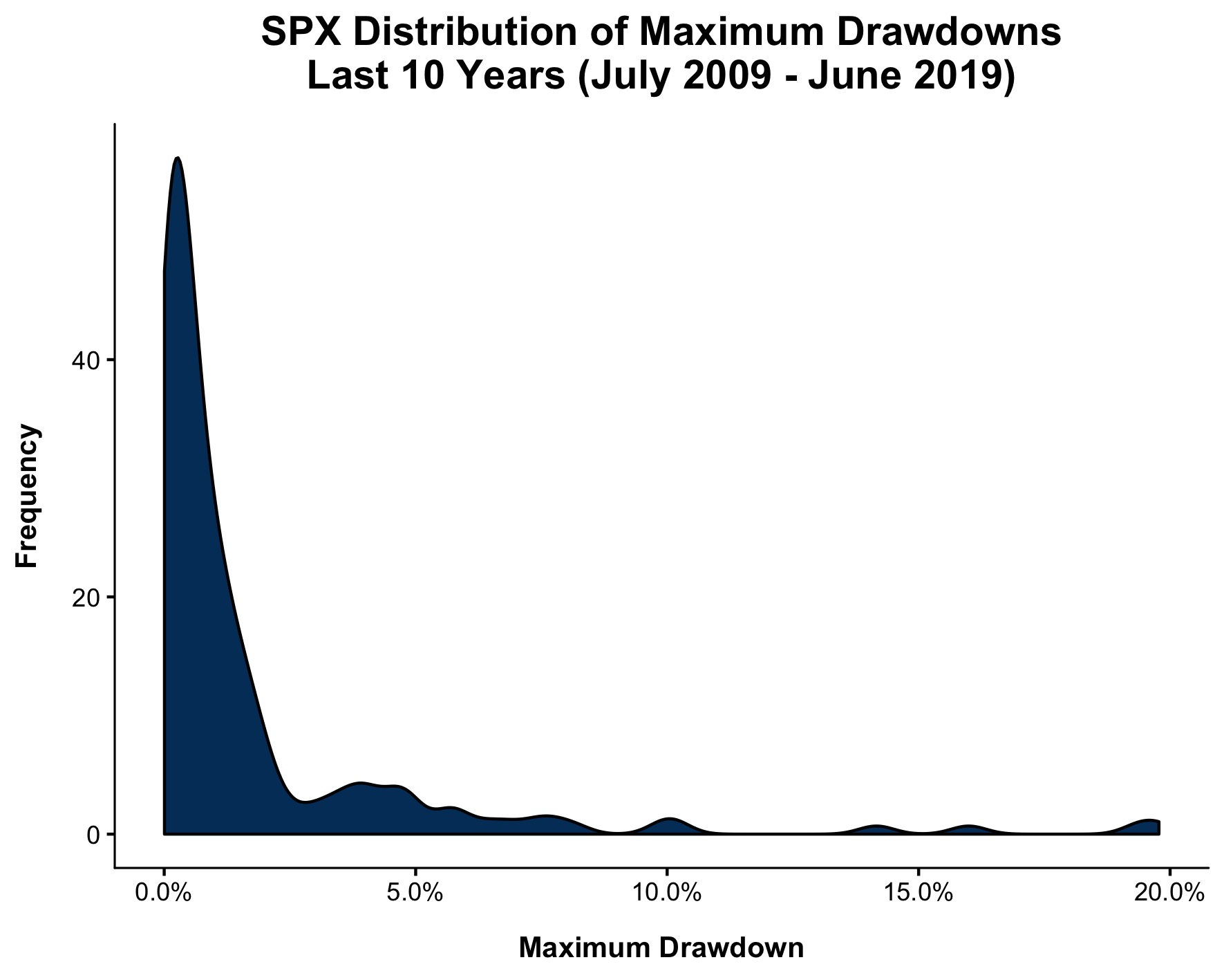
The chart below is a way to show how shallow the average drawdown was over each ten year period. There were 167 distinct drawdowns in this time. 8.4% of them have been greater than 5% and just 3% of them have been greater than 10%. Said differently, ~97% of dips didn’t even reach “correction” territory.
It’s hard to appreciate the good times when you’re in the middle of them, which is why it’s helpful to turn to the data. Narratives hide the present, numbers reveal them.
Looking at the numbers, one can easily make the argument that we just lived through the best ten-year period ever for U.S. stocks. Which means what, exactly?
Well, it’s hard to say. Can this bull market continue? Yes, of course. It’s already gone on longer than many people thought it would, myself included. But is it likely to be as strong as it was over the last ten years? No, almost certainly not.
In a system as unpredictable as the stock market it’s difficult to make predictions, but if there are any iron laws we can learn from studying the past, it’s that the good times don’t last forever. I’m not saying we’re about to enter a lost decade, but I’m very confident that the next ten years won’t be as smooth as the last one.