Jeremy Grantham is going for it. In his latest piece, Waiting For The Last Dance, he writes:
“I believe this event will be recorded as one of the great bubbles of financial history, right along with the South Sea bubble, 1929, and 2000.”
Yikes
Grantham is famous for calling the Japanese, tech, and housing bubbles. So when he speaks on this topic, investors pay attention. You can’t mention his prescient calls without mentioning the ones that didn’t come to fruition. It’s only fair to point out that he has been bearish for much of the recent bull market.
I include these bullet points not to dunk on Grantham, a living legend, but rather to show the full picture. If his latest piece scares the heck out of you, understand that listening to him over the last decade could have prevented you from missing out on a once in a lifetime bull market.
- 2010 – Have Cash, Wait for Stocks to Fall
- 2011 – Grantham sees most global equities as ranging from “unattractive” to “very unattractive” – valuing the S&P 500 at “no more than 950.”
- 2012-Jeremy Grantham Warns 2013 Will Be A Dangerous Year For Stocks
- 2013- Much of everything else is once again brutally overpriced
- 2014- Big stock bubble will end badly in 2016
- 2015- GMO founder Grantham says markets ‘ripe for major decline’ in 2016
Okay, you get the point. After 2015, Grantham softened up a bit and wrote an introspective piece in Barron’s that I remember reading fondly. You don’t see major figures on Wall Street write something like this too often. (emphasis mine)
I consider myself a bubble historian and one who is eager to see one form and break: I have often said that they are the only really important events in investing.
I have come to believe, however, very reluctantly, that we bubble historians have, together with much of the market, been a bit brainwashed by our exposure in the last 30 years to 4 of the perhaps 6 or 8 great investment bubbles in history: Japanese land and Japanese equities in 1989, U.S. tech in 2000, and more or less everything in 2007.
For bubble historians eager to see pins used on bubbles and spoiled by the prevalence of bubbles in the last 30 years, it is tempting to see them too often.
It’s been over four years since he wrote this. Now, he sees bubbles again. In Waiting For The Last Dance, Grantham sites the usual suspects. Investor enthusiasm, coupled with high valuations, has preceded all major market bubbles. He writes:
The one reality that you can never change is that a higher-priced asset will produce a lower return than a lower-priced asset. You can’t have your cake and eat it. You can enjoy it now, or you can enjoy it steadily in the distant future, but not both – and the price we pay for having this market go higher and higher is a lower 10-year return from the peak.
It’s hard to argue with Grantham when he says, “a higher-priced asset will produce a lower return than a lower-priced asset.” It’s hard, but I’m going to try anyway. I have a massive amount of respect for Grantham, so I hope this does not come off as disrespectful. I’m just trying to provide an alternate view
Let’s look at how expensive U.S. stocks are based on traditional valuation metrics, via Michael Cembalest. Most of these data points indicate that stocks are pricey, in some cases, more expensive than they’ve ever been.
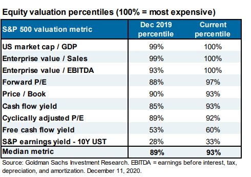
One of the most popular methods that market historians use is the CAPE ratio, which I want to discuss briefly. At just under 34x, it’s the second-highest it’s ever been, behind only the tech bubble in 2000.

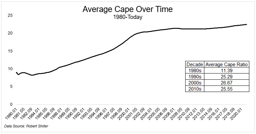
But slow down. The long-term average is very long term. Half of this data series is from 1881 to 1950. The world has changed a bit since then. The fact that a 57% crash in the S&P 500 brought the CAPE ratio back to its long-term average for about a minute should tell you all that you need to know. In case that doesn’t convince you, here are some other things to chew on.
Look at this chart from the Credit Suisse Yearbook, which shows the industry weightings from 1900 and today. You might notice some things are different, like, well, everything.
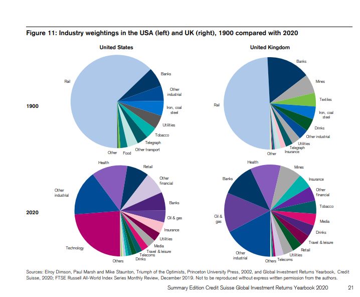
The next chart is an even better look at how the market composition has changed over time. It’s apples and oranges.

One other thing the long-term does is hide the medium long-term. Including numbers from the 1800s masks the fact that the CAPE ratio has been rising for decades, as I wrote about in 2017, “Should Stocks Be Worth More Now Than They Used to Be?
The average CAPE ratio for the entire data series is 17. But it averaged 25 in the 90s, 26.7 in the 2000s, and 25.5 in the most recent decade. We haven’t once talked about how things like low interest rates, low inflation, Fed intervention, fiscal policy, or market structure affect market behavior, but those are different stories for a different day.
At 34x on the CAPE ratio, it’s impossible to argue stocks are cheap. I won’t do that. But what if we’re looking at the wrong metric?
Ensemble Capital recently tweeted:
“The 9% long term rate of return to US equities has historically come from a 4% FCF yield and 5% growth. In the decade since 2009, there have been regular claims that we were back in a bubble, but the FCF yield suggested valuation was not stretched. This is still true today.”
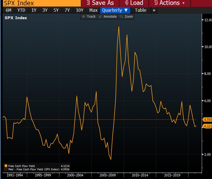
Using this metric, we’re in the 60th percentile. Not cheap, but really not close to expensive.
Bear markets are painful, and if we could reliably avoid them, we would all choose to do so. But we can’t, so let’s not pretend like we can.
People always talk about surviving a bear market and I agree that it’s critical to building wealth. If you cannot make it through a bear market without losing your wits, you will never have decent returns. But if you can’t survive a bull market without jumping off every time we hit a new high, you will have horrible returns!
I will go on record that I don’t think this is anywhere near like 1999 or 1929, despite what the CAPE ratio says. Are there pockets of excess? Absolutely, I’m not blind. But a 70% decline in the major averages? Sorry, I don’t see it.