Josh and I spoke recently about the slow grind higher, the lack of volatility, and all the recent stock market records. The very first response in the comment section was, “market overdue for a pullback.”
This seems to be the prevailing narrative and I gotta be honest, I agree. I’m just as surprised as anyone that the market keeps grinding higher.
Here are a few data points, by way of the S&P 500.
- The index has closed within 2% of the all-time high for 68 straight days
- The index has gone 70 days without a 1% decline, the sixth longest streak over the last 20 years.
- Four out of five stocks are above their 200-day moving average
- The S&P 500 is currently 11% above its 200-day moving average.
Rather than relying on our collective intuition that we’re due for a pullback, I wanted to look at what the data said. For this analysis, as a measurement of stocks being over extended, we looked at the S&P 500 when it was 10% above its 200-day moving average.
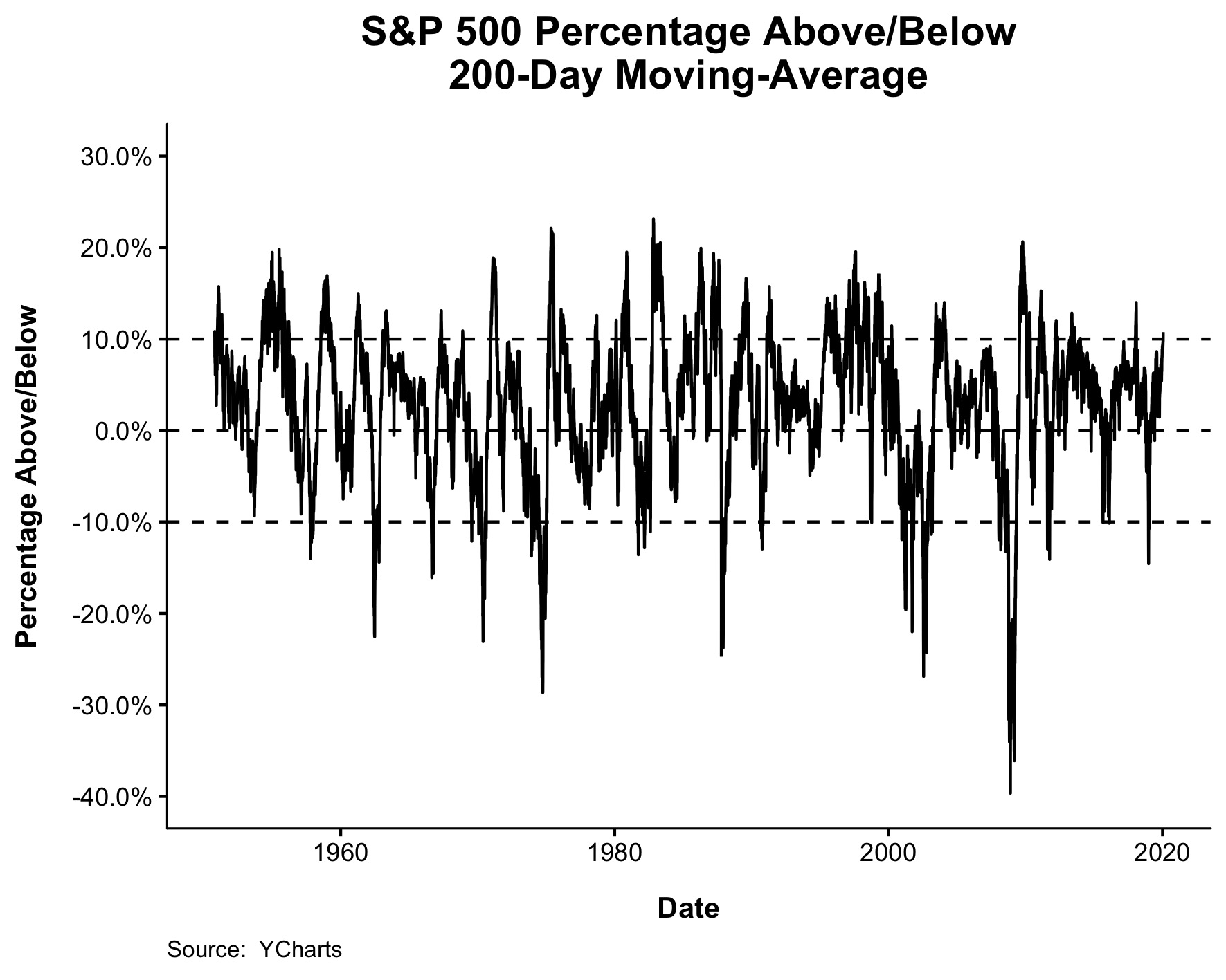
Before we go any further, there is nothing particularly special about the 200-day. We (Nick) also looked at the 50 and 100-day and they all told the same story. The chart below shows when the S&P 500 has been more than 10% above its 200-day moving average.

You’ll notice a few things right off the bat. This sort of thing, when stocks are extended, tends to happen at all-time highs and in deep drawdowns. The latter might be counter intuitive but think about huge bounces off the lows, like the GFC for example. By September 2009, the S&P 500 was 20% above its 200-day moving average even as it was sat 32% below all-time highs.
Since 1950, when the S&P 500 is at least 10% above its 200-day moving average, 59% of the time it was within 2% of its all-time high, and 13% of the time it was in a greater than 20% drawdown.
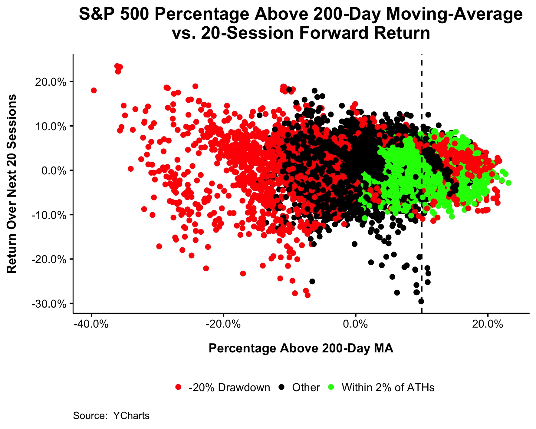
You can see this broken down in the chart below, which shows how far above or below the S&P 500 was relative to its 200-day moving average on the x-axis, and returns over the following 20 days on the y-axis.
This next chart is the same as the one above, only truncated to show just the 20-day returns after the S&P 500 was 10% above its 200-day moving average, which is where we are today.
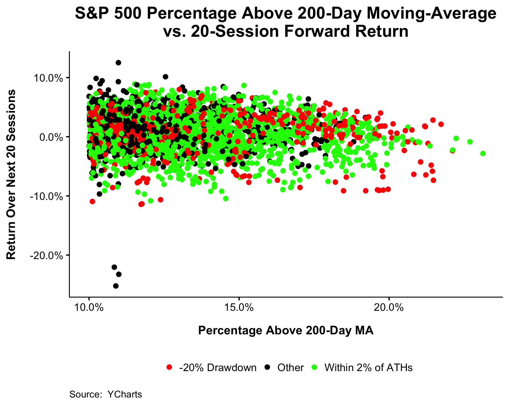
As you can see, it’s hard to say anything definitive about returns based on this metric alone. As the percentage above the 200-day climbs towards its maximum height, I guess you can say that stocks tend to run out of steam in the short-term. I should mention that we also looked at 40 and 60-day returns and they told the same non-story.
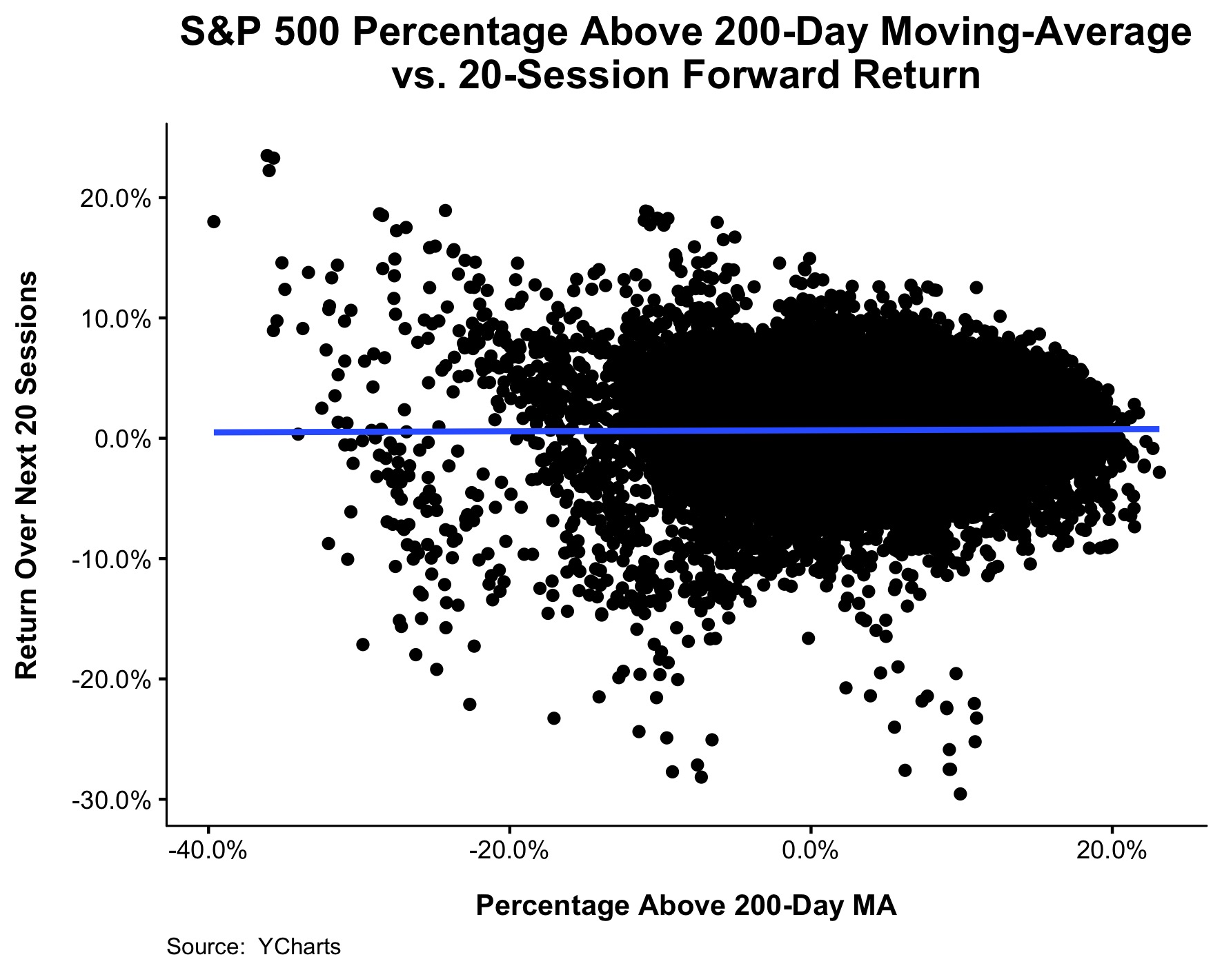
Finally, look at the chart below. How far above or below the S&P 500 is relative to its moving average tells you nothing about how stocks will behave over the short term. That blue line wasn’t plotted at zero, it’s actually the line of best fit! I don’t know if I’ve ever seen a variable with less predictable power than this.
If you’re reading this, you’re probably not a professional trader and you probably don’t need to spend much time thinking about whether or not the market is due for a pullback. Don’t misunderstand, I’m not saying we won’t have a pullback, I’m not saying stocks are cheap, I’m not saying now is a good time to use infinite leverage. What I absolutely am saying is that if you’re saving investing for retirement, you shouldn’t be making changes to a portfolio that you don’t plan to use for another few decades based on feelings.
Spend more time on making sure your personal finances are in order and less time worrying about what the market will do next week.