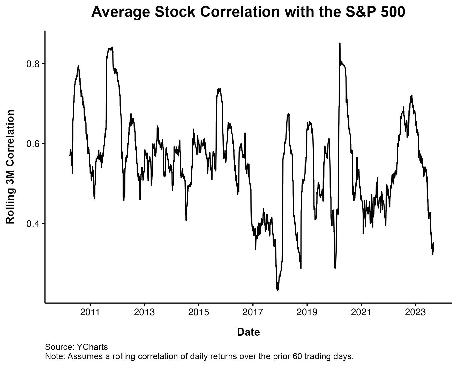
One of the gripes investors had with the stock market during the ZIRP era was that every stock moved together. Fundamental analysis wasn’t rewarded because buying sent everything higher, and selling sent everything lower. This isn’t exactly true, but it’s not exactly wrong either.
During the early part of the last decade, as we were coming out of the Great Financial Crisis, the money printing machine was in full swing. One of the side effects, so the complaints went, was that stock selecting was a fool’s errand when the fed was pushing all stocks up.
You can see that the average stock did, in fact, have a very high correlation with the rest of the market. This relationship has ebbed and flowed over the years, but right now it looks like stocks are moving on their own individual merits. There are winners, and there are losers. This is the way.
It’s nice to see the data corroborate what your eyes tell you. If you watch the market closely, you know this to be the case.
The “ARKK” names, which were all one trade in 20 and ’21, are moving up or down, not up and down.
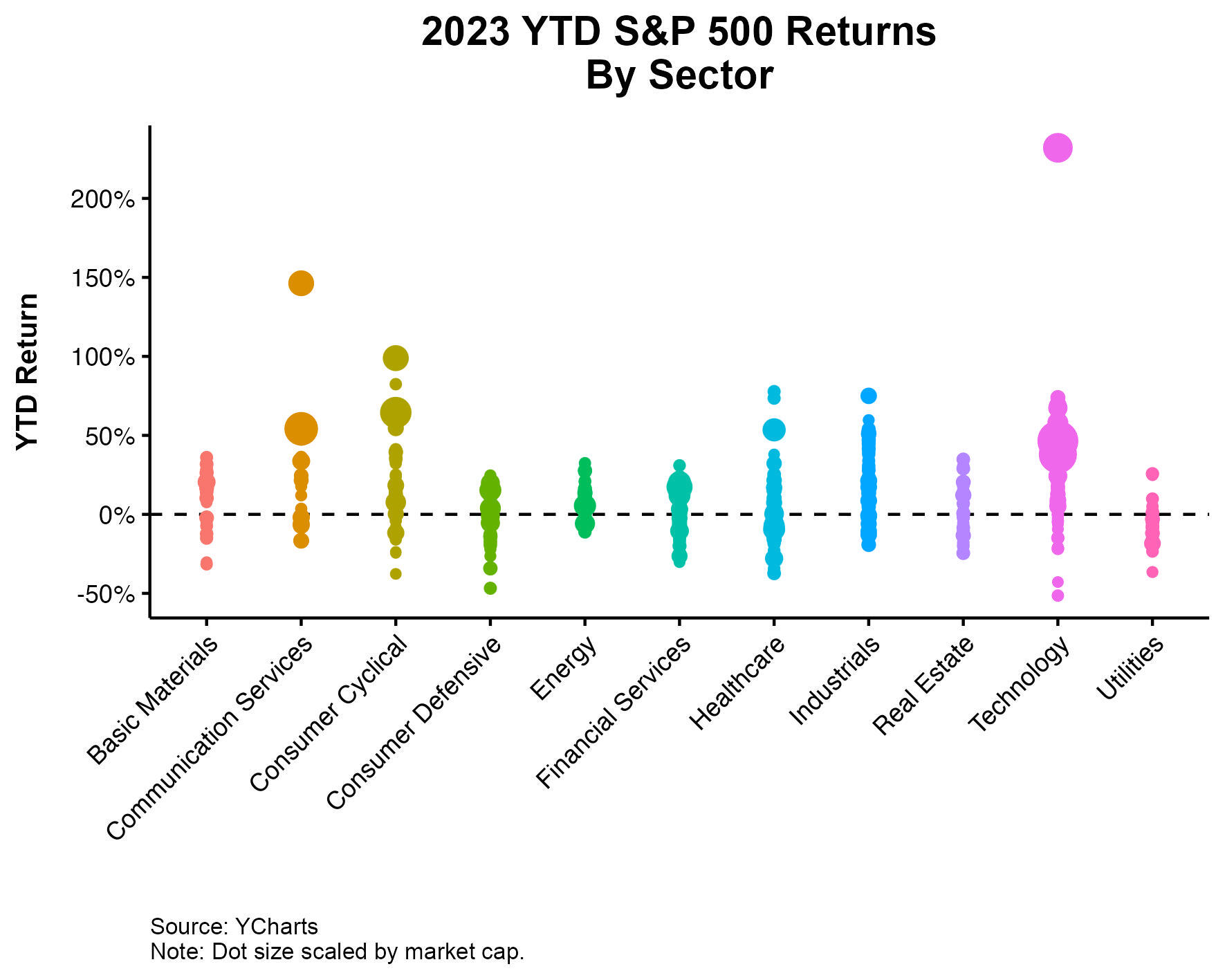
I had the great Nick Maggiulli create a chart that shows how all the stocks in the S&P 500 are performing within each sector. Consumer cyclical are all over the place. So are technology stocks. Healthcare too. This makes sense as these sectors comprise very disparate companies. On the flip side, it also makes sense that energy stocks tend to trade as a group, given how tied they are to the underlying commodities.
Since the fed backed off of QE, the market is separating the wheat from the chaff. This is what active managers have been waiting for. But in a cruel twist of irony, while there is plenty of opportunity to select winners and avoid losers, the biggest names are the biggest winners, making the market, once again, very difficult to beat. Same as it always is.
Michael Batnick is a managing partner at Ritholtz Wealth Management. He is the co-host of Animal Spirits, What Are Your Thoughts, and The Compound and Friends. For disclosure information please see here.
Get a Full Investor Curriculum: Join The Book List
Every month you'll receive 3-4 book suggestions--chosen by hand from more than 1,000 books. You'll also receive an extensive curriculum (books, articles, papers, videos) in PDF form right away.