The NASDAQ 100 just had its worst week since 2008. Every stock in the index finished in the red. Twenty-one fell at least 10%.
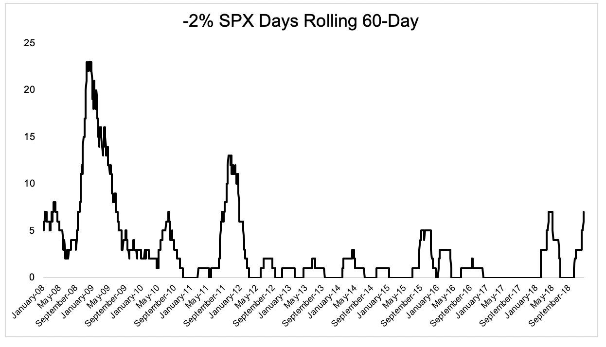
There wasn’t a single -2% day in the S&P 500 from October 2016 through January 2018. There have been 7 over the last 60 sessions
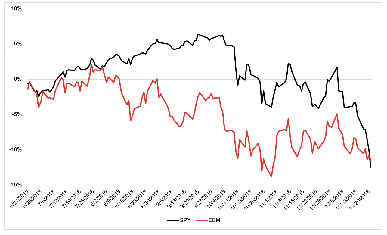
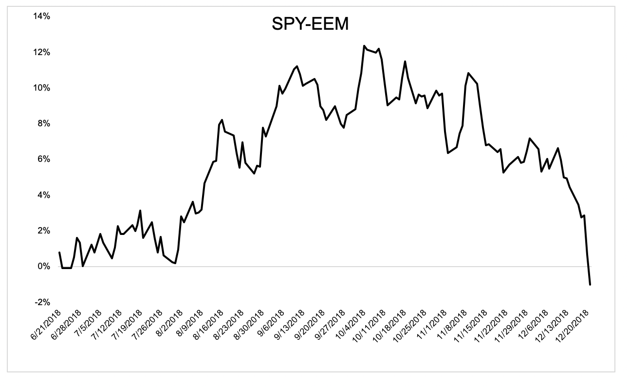
Something interesting has been going on the past six months that a lot of investors aren’t aware of. The U.S. had been far outpacing the rest of the world, particularly emerging market stocks. But recently, that’s begun to change.
This chart shows the difference in performance over the last six months, the black line minus the red. This was one heck of a relative round trip.
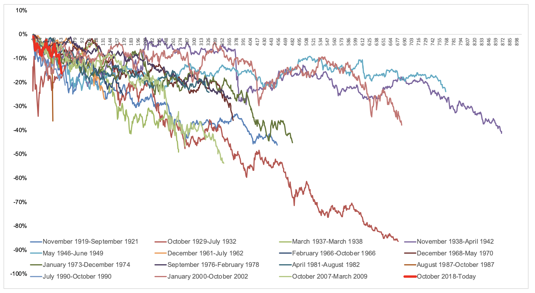
If U.S. stocks are entering a bear market, they likely have a ways to go before they reach a bottom. You can see where we currently are (red) versus the 15 bear markets we’ve had over the last century (DJIA). The selling might be jarring because the speed at which it’s happened, and the absence of any short-term relief, but this chart should put today’s declines in perspective. I’m not saying this doesn’t hurt, but there’s a big difference between pain and trauma. We ain’t seen nothing yet.
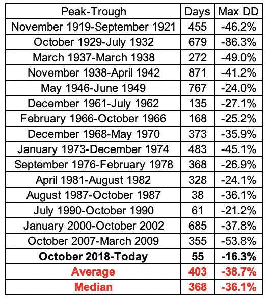
The table below shows the numbers from the chart above. The average bear market has lasted just over 400 days and saw a 38% decline. Some were shorter and shallower, others were longer and deeper, but I actually think this is a rare case where the average provides decent context for the pain a bear market entails.
There are things that matter over the long-term that are completely meaningless in the short-term. Valuations are a good example; Buyers didn’t care on the way up and sellers won’t care on the way down. It’s easy to get caught up in narratives and stories but nobody knows why stocks are going down and nobody knows when this is going to turn around.
Nobody said investing was easy. Drawdowns are the cost of future gains, and every successful investor has their fair share of receipts.
Michael Batnick is a managing partner at Ritholtz Wealth Management. He is the co-host of Animal Spirits, What Are Your Thoughts, and The Compound and Friends. For disclosure information please see here.
Get a Full Investor Curriculum: Join The Book List
Every month you'll receive 3-4 book suggestions--chosen by hand from more than 1,000 books. You'll also receive an extensive curriculum (books, articles, papers, videos) in PDF form right away.

 If U.S. stocks are entering a bear market, they likely have a ways to go before they reach a bottom. You can see where we currently are (red) versus the 15 bear markets we’ve had over the last century (DJIA). The selling might be jarring because the speed at which it’s happened, and the absence of any short-term relief, but this chart should put today’s declines in perspective. I’m not saying this doesn’t hurt, but there’s a big difference between pain and trauma. We ain’t seen nothing yet.