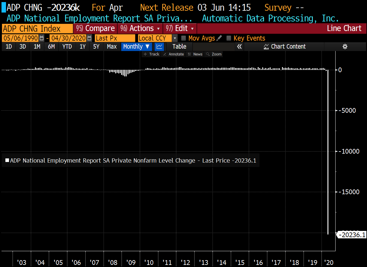
Private payrolls were just released, and we found out that they fell by more than 20 million in April, which is the worst drop in ADP survey history. This chart, like so many others, has been permanently impaired by the complete halt in economic activity.
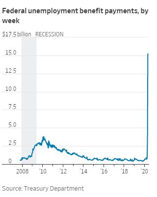
This chart from the WSJ shows the massive amount of unemployment benefits being paid out by the federal government.
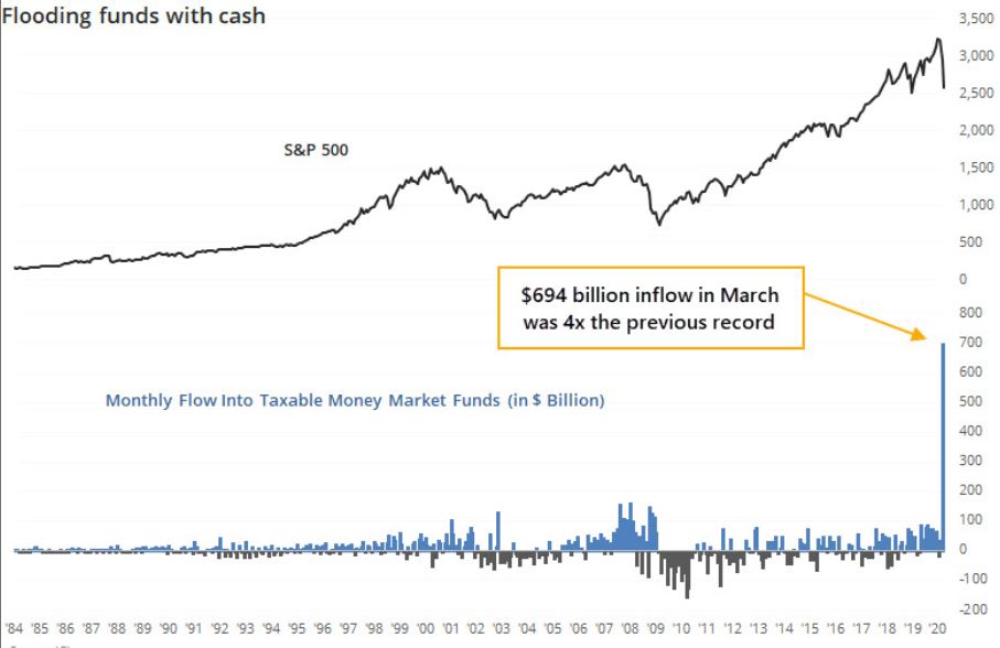
Money market funds took in $694 billion in March, which was 4x the previous record. This comes from Jason Goepfert, who puts out tons of great charts. .
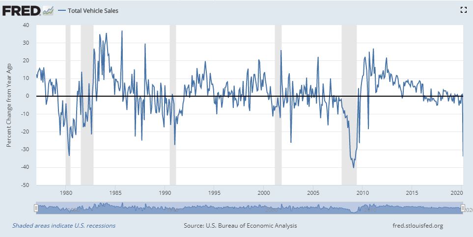
Total vehicle sales fell 34% in March. These numbers are expected to break the charts in April, with Toyota saying they experienced a 55.7% decline, and Honda in the same boat, saw sales fall by 54.1% decline.
The ISM manufacturing index fell to the lowest level since 2009. The index for new orders fell 27%, the largest monthly drop since 1951. Production fell 27.5%, to the lowest level on record. The employment index, shown below, fell to the lowest level since 1949, and experienced the largest one-month decline since the series began in 1948.
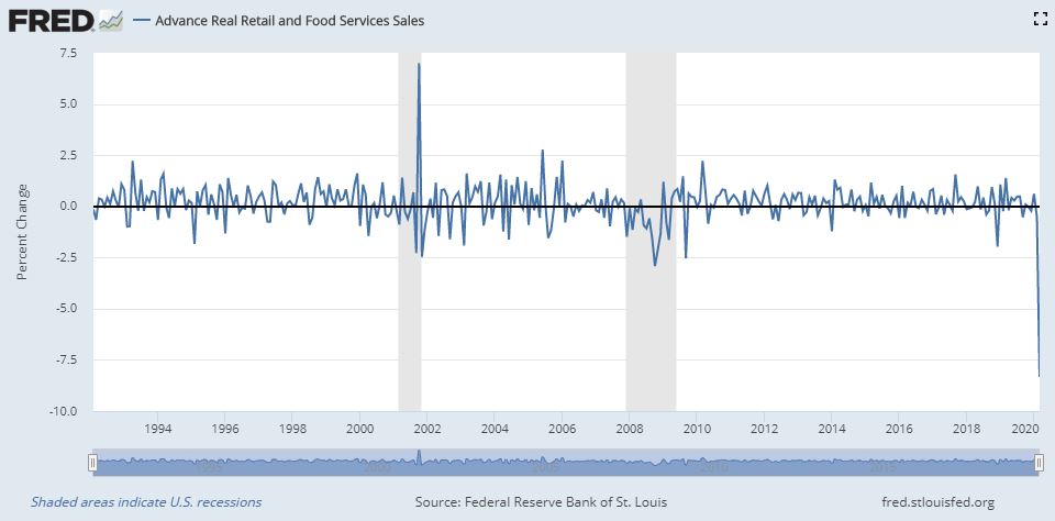
Retail sales had their worst drop on record, falling more than 8% from their prior month.
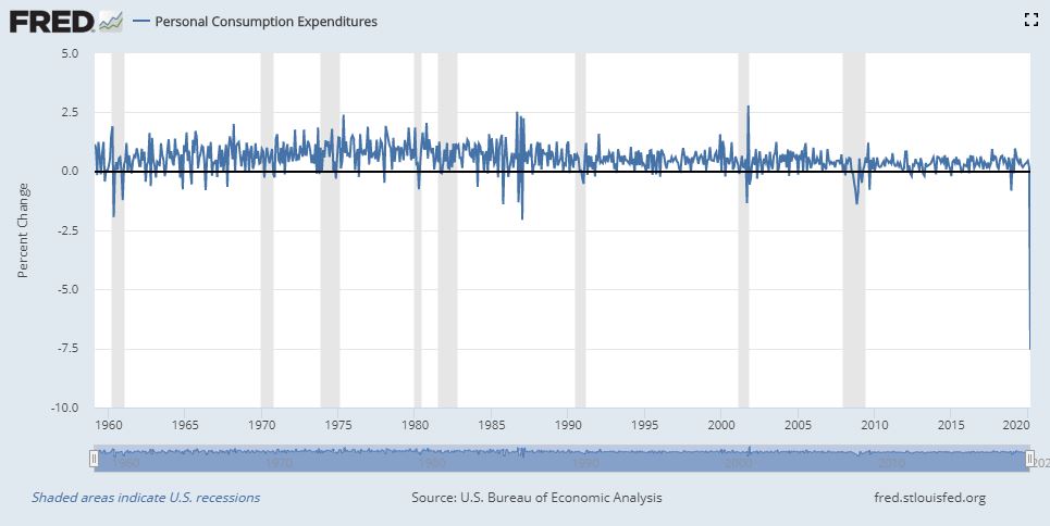
Personal consumption, which accounts for roughly 70% of U.S. GDP, fell 7.5% in March, the largest drop on record.
It is going to be incredible looking back on these charts in 20 years, but for now, we’re all looking forward to them getting back to normal.
Michael Batnick is a managing partner at Ritholtz Wealth Management. He is the co-host of Animal Spirits, What Are Your Thoughts, and The Compound and Friends. For disclosure information please see here.
Get a Full Investor Curriculum: Join The Book List
Every month you'll receive 3-4 book suggestions--chosen by hand from more than 1,000 books. You'll also receive an extensive curriculum (books, articles, papers, videos) in PDF form right away.