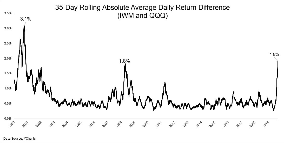
The last few weeks have been the craziest period for tech stocks relative to small stocks since the dotcom bubble.
The chart below shows the average difference in daily returns over rolling 35 day periods.
I know that was a mouthful, but what this simply means is that over the last 35 days, the average daily difference in returns between IWM and QQQ is 1.9%.
Smaller stocks have been under immense pressure due to the fact that they’re more sensitive to economic contractions, and a complete economic shutdown is the mother of all contractions. Large tech stocks on the other hand have proven thus far to be more resilient to our new normal.
The NASDAQ-100 is not just tech anymore. It’s 6% consumer staples, even has 2% of the portfolio in industrials. But 34% of the portfolio is Microsoft, Apple, and Amazon, and where they go the Qs follow.
Speaking of weights, this is one of the craziest charts I’ve ever seen. The outperformance of the 50 biggest stocks in the S&P 500 relative to the rest of the index has gone parabolic.
Unlike other indices, the biggest firms in the S&P 500 “are in sectors that have benefited, at least in relative terms, from measures taken to control the spread of the virus,” says @CapEconUS. Like I.T. and comm services
The market has been repricing risk assets over the past few weeks and is still trying to find an equilibrium. It’s hard to know where the dust settles and when, but right now this is one of the most interesting areas I’m watching.
Michael Batnick is a managing partner at Ritholtz Wealth Management. He is the co-host of Animal Spirits, What Are Your Thoughts, and The Compound and Friends. For disclosure information please see here.
Get a Full Investor Curriculum: Join The Book List
Every month you'll receive 3-4 book suggestions--chosen by hand from more than 1,000 books. You'll also receive an extensive curriculum (books, articles, papers, videos) in PDF form right away.