In 2018, Research Affiliates wrote an article called CAPE Fear: Why CAPE Naysayers Are Wrong. One of the naysayers was yours truly.
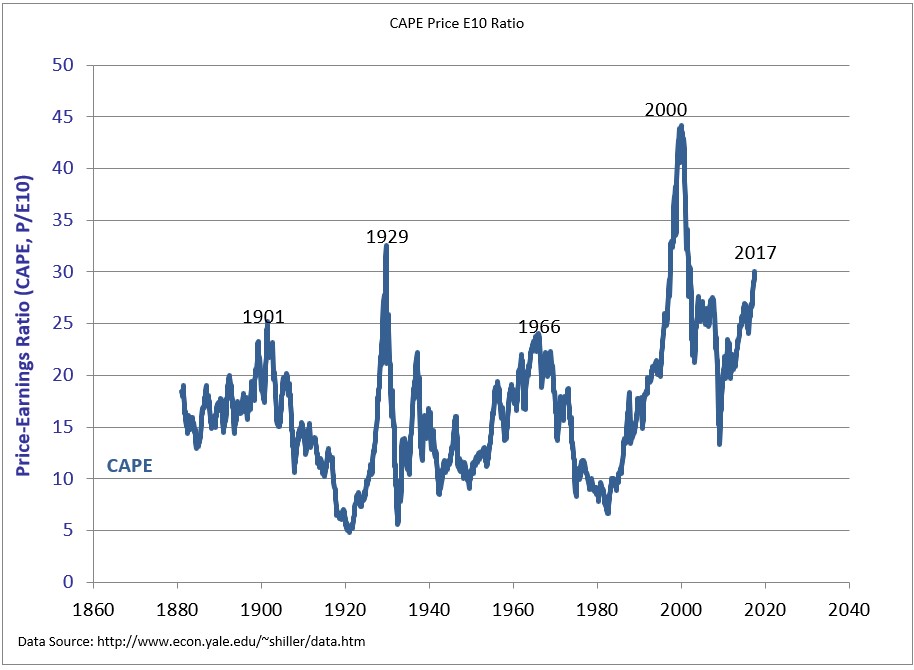
I tweeted that quote in July 2017, as the CAPE ratio crossed 30 for just the third time ever. The two other markets that saw such lofty valuations were 1929 and 2000. Gulp.
To be very clear, at that time, I was in the “lower your return expectations camp” due to a combination of recent performance and high valuations. The stock market has more than doubled since I wrote this. I’m still in this same camp of lowering your return expectations, which I wrote in a 2020 post called Preparing for Lower Returns.
I guess where Research Affiliates and I disagreed was that I was open to the idea that higher multiples were justified. In early 2017 I wrote a post, Should Stocks Be Worth More Now than They Used to Be? I made a few points that were true then and are still true today.
Using a data set from 1881-2017 and equal-weighting the entire series makes no sense. We should be overweight data from today versus information ten years removed from the Civil War. At the very least, we should take a look at how the average has changed over time, in real-time. This chart shows that the average CAPE ratio has been on the rise for the last few decades, and for good reason.**

If you still think we should be giving equal consideration to 10 years worth of real earnings when the Titanic sunk to profits from today, maybe this will help change your mind; After the dot-com bubble burst, the lowest the CAPE got was 21. Well above the long-term average of 17.3. Since 1990, we’ve been above the long-term average 95% of the time! Over the last 30 years, 1990 and 2009 were the only times the CAPE was below it.

Why has the long-term CAPE ratio been neutralized, if not rendered useless? Because so much has changed in the world since the inception of this data set. Here are a few examples I made in 2017.
- We’re using data going back to 1881. Should $1 of earnings generated by Facebook be worth as much as $1 generated by Standard Oil or Edison General Electric?
- America’s first billion-dollar corporation was U.S. Steel. In 1902 they employed 168,000 people and had sales of $561 million or $3,340 in revenue per employee ($90,000 in today’s dollars.) Today, U.S. Steel’s revenue is $493,000 per employee, 5.5.x the amount it was in 1902.
Long-term data series completely ignore changes in the way we do business. The following chart is one of the most important visuals to understand the progress that’s been made over the years. To say that it explains everything** we’ve been arguing about over the last ten years would be an exaggeration, but only slightly. It shows the net profit margins of tech stocks exploding upwards over time.

This chart explains how Apple became a $3 trillion company. It explains how Google has had an annual average return of 26% a year since 2015 and how Nvidia did 100% a year over the same time. And it explains how the S&P 500 has had a record run since the bottom in 2009, driven by record margins and record earnings.****

Comparing the CAPE ratio today to the CAPE ratio in 1960 is like comparing Russell Westbrook Ja Morant to Oscar Robertson.
But, and there is a but, I still think valuations matter. And I still think we should prepare for lower returns. Even though I don’t think we should compare the CAPE today versus 1880, we can compare it to recent history. And even if we use the average from 1990-today, which is 26, we’re at 39 today. Maybe it’s justified, but it probably isn’t.
What to do when you’re preparing for lower returns is an interesting question, but I’ve already spent too much of my Saturday writing, so I’ll leave that for another day.
*I’m not the CIO, but thank you for the promotion
**No argument about what drove stocks over the last decade is complete without the fed, obviously.
*** At any point in history, if you plotted the average at a given point, it would be a horizontal line. But I argue that is misleading for a data set that spans nearly 150 years. So I adjusted it. The chart that I made is dynamic. For example, in 1960, I’m taking the average from the beginning of the data set through 1960. I’m doing the same at 1970, 1990, and today.
****I know, the fed.